Haas
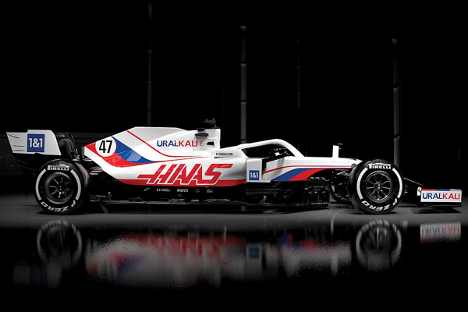
Image Courtesy of AutoSport.com
Yikes. I tend to disagree with many choices Haas makes, but this car is just plain ugly. It’s so bad, in fact, that the World Anti-Doping Agency opened an investigation to determine whether or not it was a portrayal of the Russian flag which is prohibited from being exhibited in sporting events. In addition to its questionable colors, Dmitry Mazepin’s Uralkali logo is featured in nine locations. I’d rather not be reminded that his son is a driver for the team, but it’s impossible to avoid the abundant sponsorship and constant indicators that Haas is dominated by the Mazepins this year.
2/10
Alfa Romeo
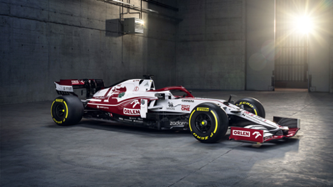
Image Courtesy of Formula1.com
Alfa Romeo’s livery is largely uninspired this year. The signature red and white is back along with primary sponsor, Orlen. I like how the team has highlighted the serpent and cross from their logo on the rear of the car, but otherwise, the sponsorships and large swathes of color blocking are more of a snooze fest than anything else. Next year, let’s give Kimi Raikkonen a more exciting paint job to contrast his rather droll demeanor.
3/10
AlphaTauri
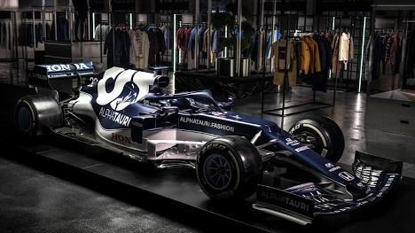
Image Courtesy of AutoBlog.com
AlphaTauri is certainly sticking to their brand. There is very little change from last year’s livery, and while the colors and logo placement are decent, it isn’t the most innovative or visually appealing car of the bunch. I would love to see an accent color or shape added to the mix of navy and white to break up the monotony. Red Bull and their affiliate team are not necessarily known for their outstanding paint jobs, so I wouldn’t expect much more from AlphaTauri this year.
4/10
Red Bull
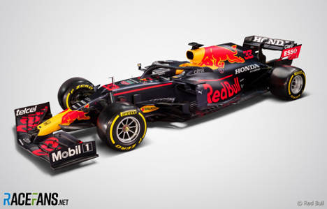
Image Courtesy of RaceFans.net
I’m not overly impressed with Red Bull’s showing this year. The design is very crowded with sponsorships and Red Bull logos. I like that the team has kept consistent with their color scheme over the years, but it continues to feel busy and corporate. I would like to see a simplified or reworked version of this design in coming years, but for now, I would say the visuals are middle of the grid at best.
5/10
Ferrari
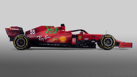
Image Courtesy of Formula1.com
Ferrari is notorious for its uniform red car with large yellow accents from Shell, UPS, and of course, the iconic Ferrari stallion. I appreciate the rear gradient with a deeper tone of burgundy as it breaks up the plain design of years past. However, as many have noted, the Mission Winnow logo on the engine cover is quite an eyesore. The bright green, while not itself offensive, distracts from the team’s branding and is too large to ignore. If the logo was white, black, or even yellow, the car might have earned a few more points.
6/10
McLaren
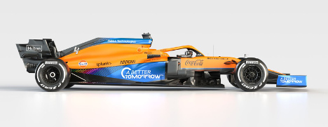
Image Courtesy of mclaren.com
While the livery of the MCL35M is not a shocking departure from last year’s car, I do enjoy the addition of the rainbow motif on the side of the car. I also like the design refresh on the blue to black gradient; the stripes are more pronounced, and they read cleaner than their previous iteration. I am disappointed, however, that the rainbow design has been removed from the halo. McLaren was a key proponent in last year’s “WeRaceAsOne” initiative, and I wish they would have kept the movement’s iconic rainbow design in a more visible area of the car.
7.5/10
Williams
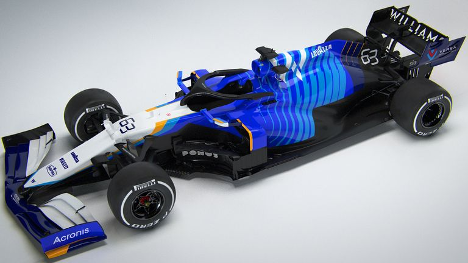
Image Courtesy of skysports.com
First thought: Dory from Finding Nemo. All jokes aside, I much prefer this design to that of previous Williams cars that mainly relied on bright blue and white. The complementary blue hues on the chassis paired with accents of orange (or dare I say McLaren papaya) is just the right amount of change; the car’s updated paint stands out from the pack, but it’s still easily recognizable as Williams white and blue.
8/10
Aston Martin
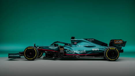
Image Courtesy of AstonMartin.com
This Aston Martin is a thing of beauty. Fans were eager to see the brand’s signature green grace the grid this year, and the newly-revived team did not disappoint. The metallic finish on the car beautifully displays the contours of the chassis, and while I wish the Aston Martin wings motif was more prominently featured, I can’t argue with the design they’ve put forth. The pink stripe feels a bit out of place, but it’s not enough to take away from my overall enjoyment of this livery.
8.5/10
Mercedes
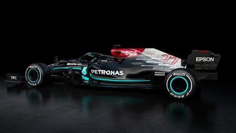
Image Courtesy of Formula1.com
Mercedes is used to being the best of the bunch, and I would say their design also hits very close to perfect. I like the shift from the classic silver chassis to a matte black. The bright Petronas teal is back, and it is even better on top of this year’s dark background. While many have decried the bright red Ineos design on the top of the air box, I think it pairs well with the rest of the color palette. I think we could all live without the obsessive amount of AMG logos on the rear of the car, but it’s a compromise I’m willing to make for an otherwise exciting livery change.
9/10
Alpine
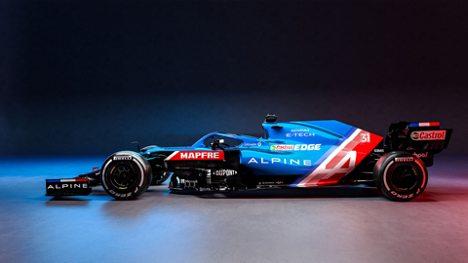
Image Courtesy of SuperCars.net
The newly-rebranded Alpine team teased an overhaul of the old Renault livery, and they delivered. This livery is one of the most stunning on the grid; it honors the team’s French roots with several motifs of the French flag, from the front and rear wing stripes to the paint designs on the body of the car. Moreover, Alpine was careful not to overwhelm the chassis with sponsor logos or brightly colored advertisements. This livery is just the right balance of corporate appeasement and beautiful visual design, and I’m very excited to see it out on the track this year.
10/10